View related contents
2) Minimizing chart window:
3) Maximizing chart window:
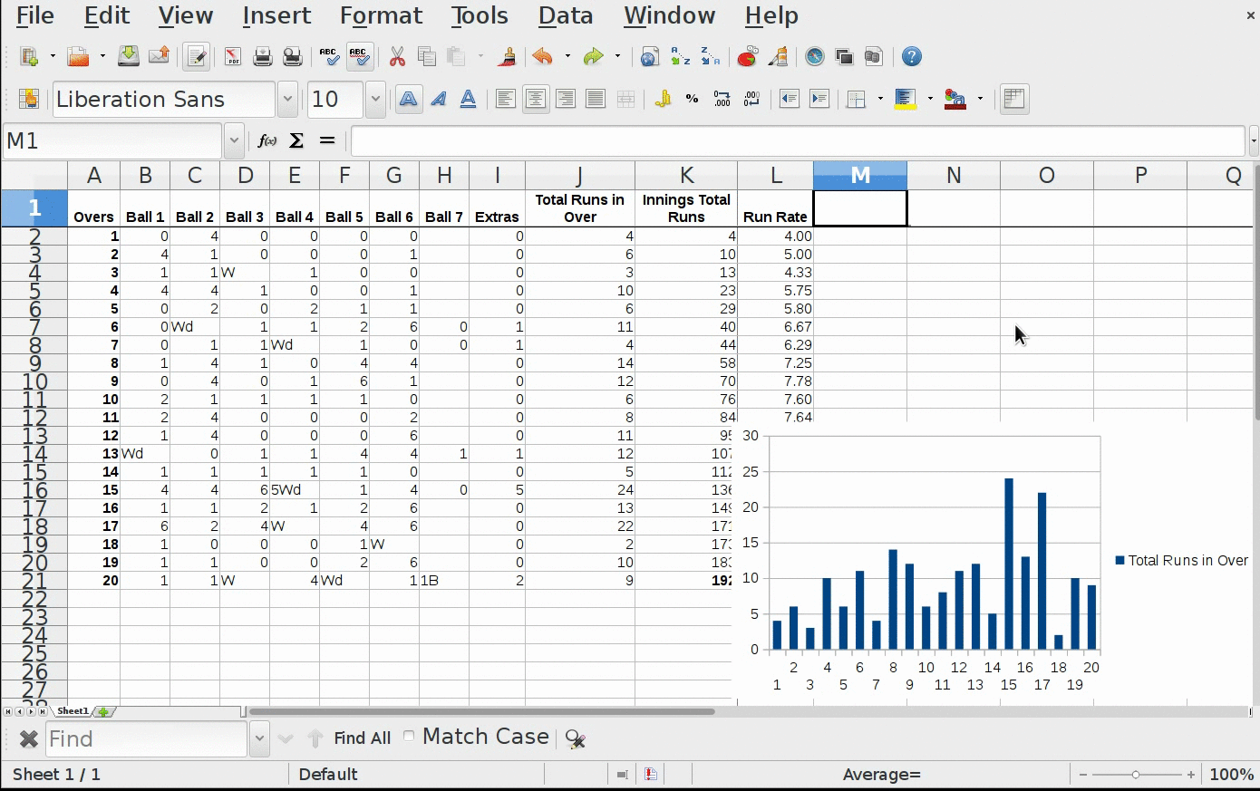
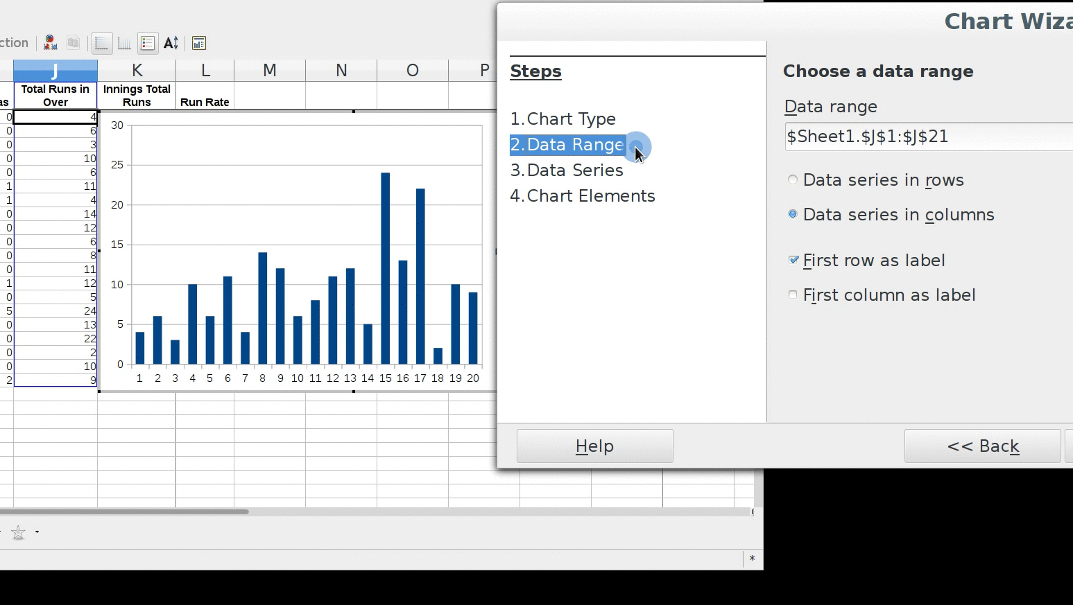
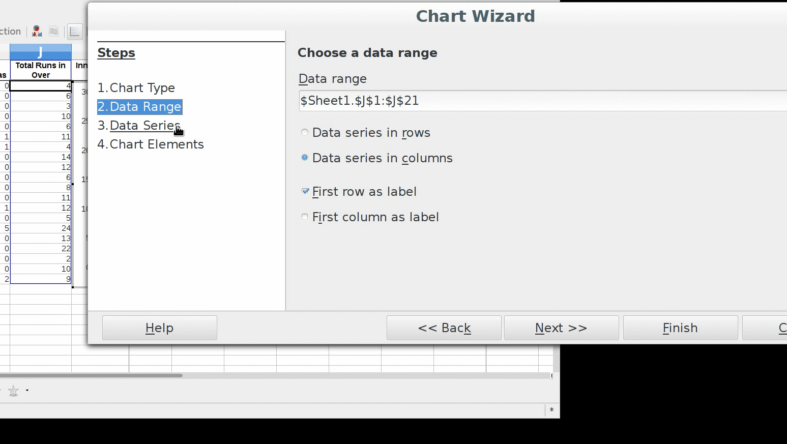
Chart data series Cell range selection: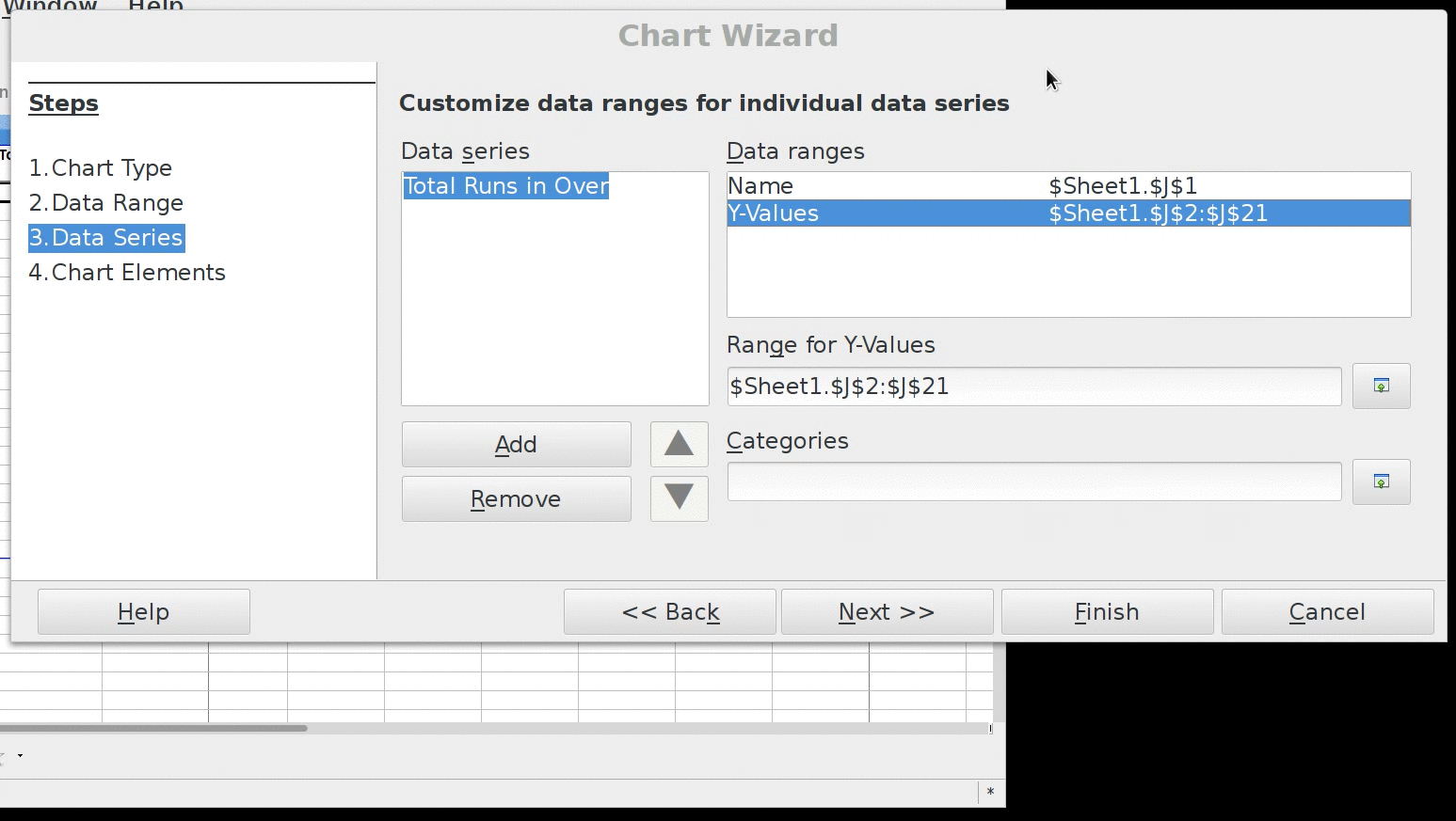
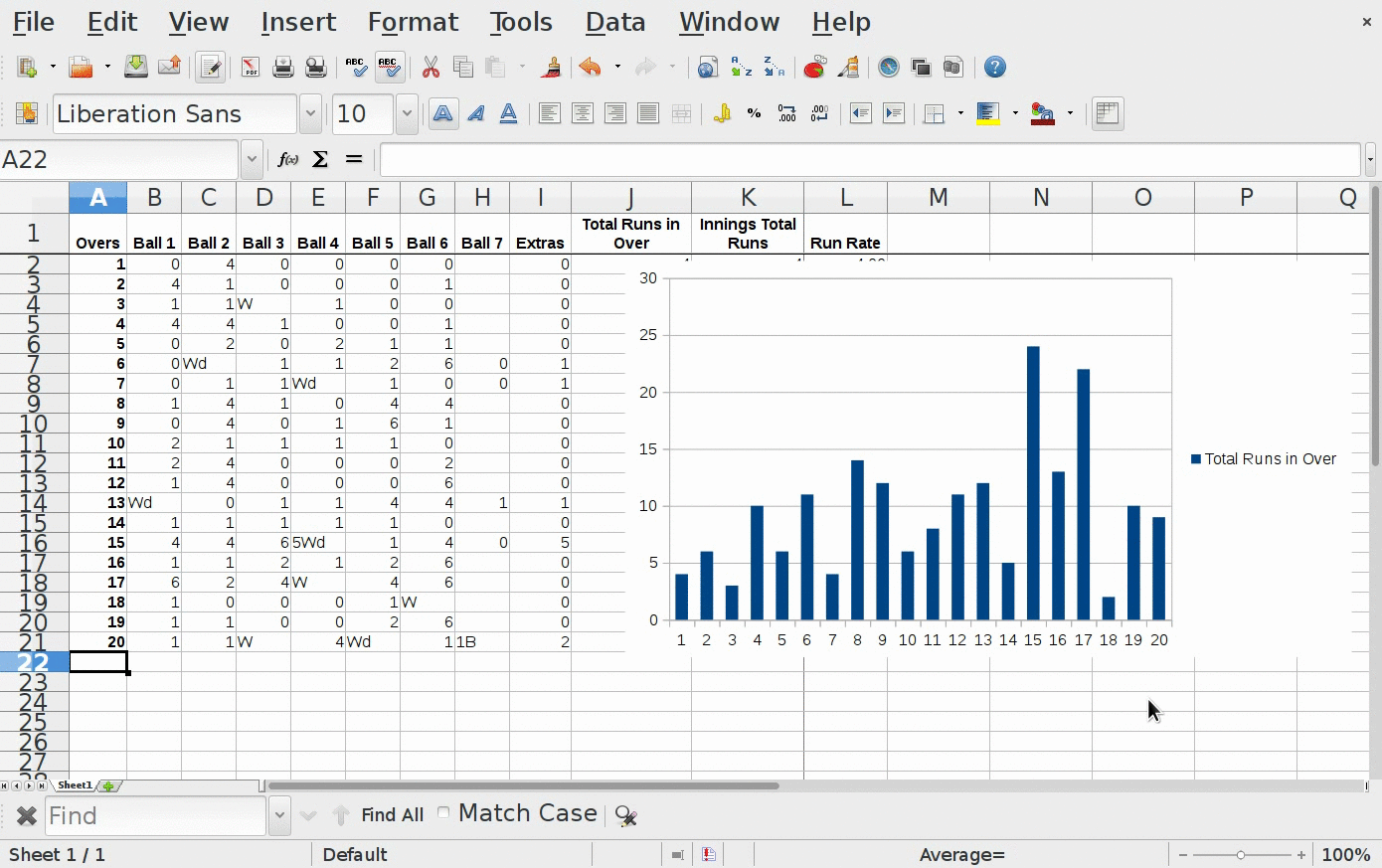
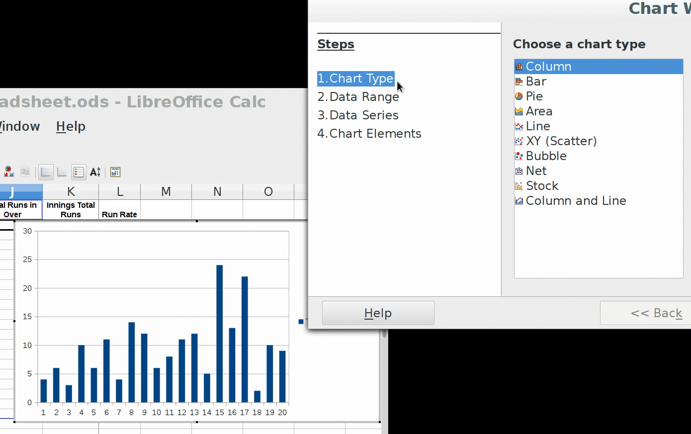
Creating Column chart for Total Runs per Over:
- Column charts present data in linear form as descrete vertical bars.
- Each vertical bar's height equals to data quantity it is representing.
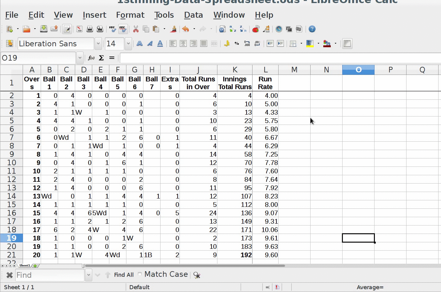
- For creating column chart, open the spreadsheet that we plotted in last session for T20 match data. (If not opened already)
- We will plot bar graph for over vs runs per over.
- Now select column "Total Runs in Over" by clicking on column header "J"
- Now open chart window, which can be done in two ways:
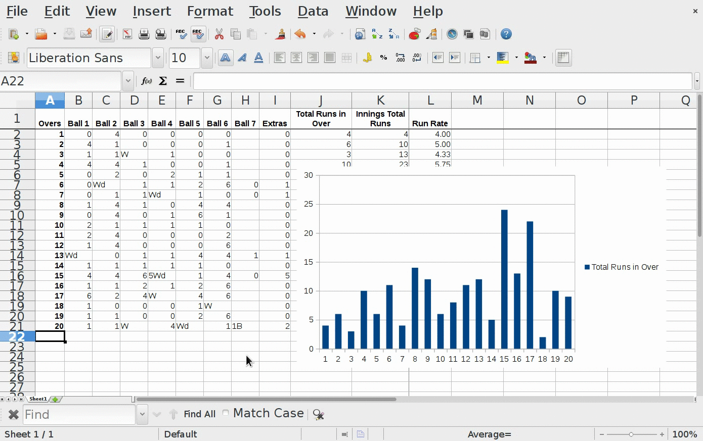
- By clicking on red circular "chart icon" present on 1st tool bar
- When we click on it, we will get two windows
- One window will show "Column chart" by default
- This column chart plots the selected column i.e. "Total Runs in Over" on Y-axis.
- And "Over Numbers" on X-axis
- It automatically selects the whole range of cells in the selected column, upto which we have entered data.
- Other window will give option like:
- Steps
- Choose a chart type
- Shape
- 3D Look
- Resulting chart after changing option
- We will explore them one by one.
- For now we will keep default option and click on "Finish".
- You will get Column chart showing Total Runs on Y-axis against Over Numbers on X-axis.
- Also you will get legend, showing color square for "Total Runs in Over"
- Legends helps in identifying which symbols are used for what purpose, thus simplifying the graph analysis process.
[Contributed by administrator on 15. März 2018 15:05:09]
Moving and Re-sizing chart windows:
- Moving, resizing comes handy when we want to keep reference of data with its graph, since by default graphs comes over data for which it is created.
- When we click on chart icon we get two windows, whose default positions can be overlapping or with some part invisible.
- We can resize and move this windows as per our convenience.
1) Moving chart window:
2) Minimizing chart window:
3) Maximizing chart window:
Data Range selection:
- Data range option provides way to select cell range different from default selection done by spreadsheet.
- Chart will show graph for selected cell range only.
- Here we also can specify:
- whether data should be row-wise or column-wise
- whether labels should be row-wise or column-wise
Chart Type:
- Chart type gives options like Column chart, Bar chart, Pie chart etc.
- We need to select the chart type as per the need of presentation of data that we want to display.
- Here we can see how different options resulting into different chart presentation.
- Using appropriate chart type for corresponding information is very important.
Data Series:
- Data series gives options:
- To select cell or cell range to be given for Data series name
- To select cell or cell range to be given for plotting data on Y-axis
- To select cell or cell range to be given for plotting data on X-axis (Categories)
Chart data series X and Y axis values:
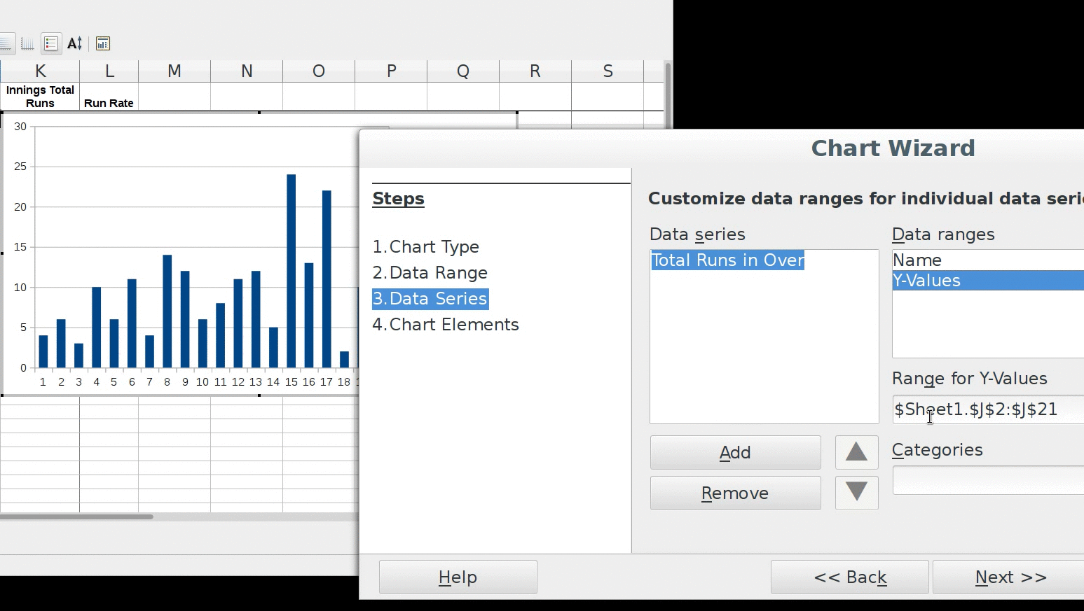
Chart data series Cell range selection:
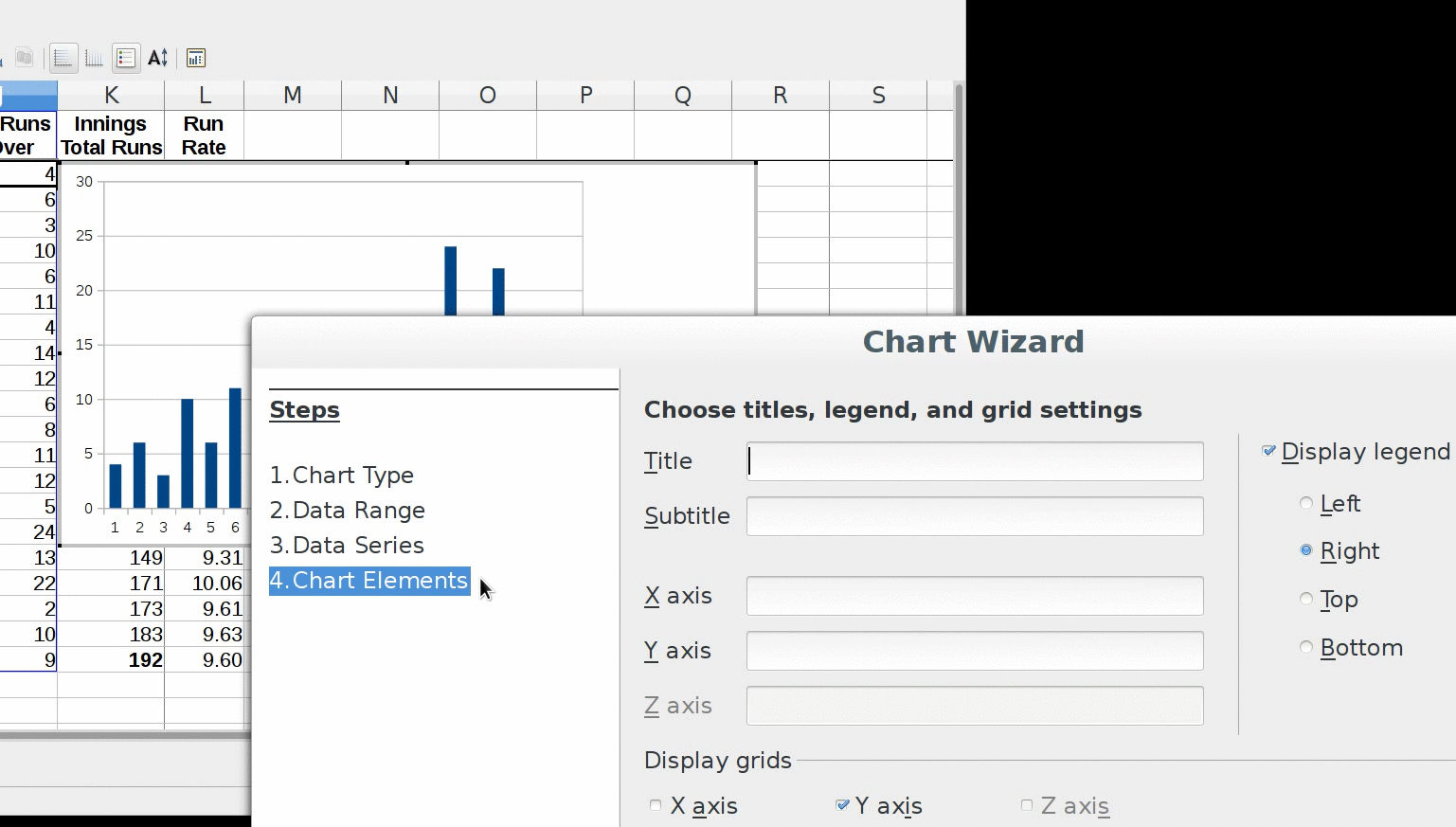
Chart Elements:
- In chart elements, we get options for:
- Giving title, subtitle for chart
- Giving labels for axis
- Display or Hide grid for axis
- Display or Hide Legend, if display then its position on chart
- These are 4 major steps that we can follow to display full detailed graph for selected data.
- Though we can create graphs by taking default settings as we done here, but it is good practice to specify Chart elements on chart.
- Other settings are required as per the arranged data and its presentation.